
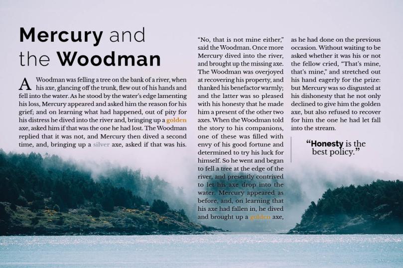
Originally I wanted to stick to an older style, so to use a lot of serifs. These fables also remind me of handwritten manuscripts. I hoped to find a typeface for a cool drop caps, but ended up just sticking to the Google fonts for the assignment—I especially like the W in Woodman. I sourced an image with water since the fable has a river in it.
I realized after I began doing the layout that the actual story was pretty long so I had a lot of different layout designs going to try to fit the text in the space and over the image. It turned out more modern than when I began brainstorming.
Here’s my take on the type pairing assignment.

This turned out really nice! I like how you made columns of different widths and fit them to the landscape.
LikeLike